

Imagine having a superpower that lets you understand your customers so well that you can predict what they’ll want next, tailor your offerings to match their preferences, and communicate with them just the right way. Well, that superpower exists, and it’s called marketing analytics. In this blog, we’ll explore marketing analytics, how it can benefit your business, and the tools that can help you harness its power. Whether you’re a beginner or looking to sharpen your skills, let’s dive into marketing analytics together!
Why Marketing Analytics Matter
In today’s rapidly changing business world driven by data, marketing analytics has become crucial for companies to remain competitive. It makes it possible for businesses to make data-driven decisions and monitor the performance of marketing efforts in real time. By comprehending customer interactions with their brand, companies can detect trends and patterns that guide marketing strategies, enabling them to expand their customer base and boost sales.
However, marketing analytics encompasses more than mere numbers and metrics: Marketing analytics lets you pinpoint precisely which activities yield the most favorable outcomes and which provide minimal contribution. It involves uncovering patterns and correlations that may take time to be noticeable but can significantly impact your overall profitability. Moreover, marketing analytics should serve as the foundation for goal-setting. By examining the performance of each stage in the sales funnel, you can devise strategies to enhance those metrics and optimize expenditure.
Breaking Down the Data Visualization Process
Discovering New Patterns:
Revealing Clear Relationships:
Storytelling with Data:
Enhancing Designs and Ads:
Exploring Tools for Data Visualization
A tool for data visualization is software made to present data in visual formats. While features may differ fundamentally, these tools enable users to input and manipulate datasets visually. Many include pre-designed templates for generating basic visualizations, although not all possess this feature.
Google Charts
Google Charts stands out as a prominent player in the data visualization market. Utilizing SVG and HTML5, it excels in producing graphical and pictorial data representations. With features like zoom functionality and cross-platform compatibility, including iOS, Android, and older versions of Internet Explorer, Google Charts offers unmatched accessibility.
Google Charts is a favored free option for professionals seeking to create interactive data visualizations for online platforms. The tool easily connects to several data sources, including Salesforce, SQL databases, and Google Sheets, leveraging HTML5/SVG technology to generate various chart types. Google’s vibrant community contributes to its extensive library of charts, featuring diverse options like bar charts, pie charts, histograms, geo charts, and area charts. While some user-generated charts may not be HTML5-compliant, they often introduce advanced functionalities, enriching the tool’s capabilities.
Tableau
Tableau is renowned for its popularity and ease of use, making it a top choice for visualizing data. With its robust capabilities, users can effortlessly link to several data sources and produce diverse charts and maps. Owned by Salesforce, Tableau is widely adopted by individuals and major corporations.
The tool offers various versions, including desktop, server, and web-based options and customer relationship management (CRM) software integration. It stands out for its compatibility with advanced databases such as Teradata, SAP, MySQL, Amazon AWS, and Hadoop. It enables efficient visualization creation from large and dynamic datasets in artificial intelligence, machine learning, and Big Data applications. While Tableau Public provides a free option, allowing users to learn the basics, it’s important to note that visualizations created on this platform are accessible to the public. This makes it suitable for introductory purposes but may be better for handling proprietary or sensitive data.
Power BI
Developed by Microsoft, Power BI is a robust data visualization tool seamlessly integrated with other Microsoft products. Its intuitive interface offers many visualization options, from basic charts to advanced visuals, making it a preferred choice for organizations within the Microsoft ecosystem. Key features include:
Interactive
Dashboards and Reports: Users can use a drag-and-drop interface to construct dynamic dashboards and reports that enable real-time data exploration and analysis.
Visualizations:
Power BI offers default visuals such as charts, maps, and graphs, along with the flexibility to create custom visuals using the Power BI custom visuals SDK, catering to diverse visualization needs.
Change Analysis:
The tool provides insights into changes in attribute values, offering possible explanations within the context of the visualization aiding in trend analysis and decision-making.
Data Modeling:
With Power BI’s robust data modeling capabilities, including Power Query and Power Pivot, users can shape and refine their data, establish relationships, and create calculated measures using DAX, ensuring data accuracy and integrity.
Developing Strategies for Diverse Marketing Reports
The fundamental strategies for diverse marketing reports provide insights into leveraging marketing analytics effectively.
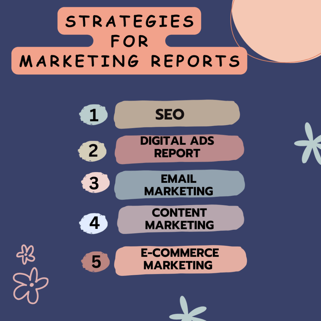
SEO (Search Engine Optimization):
Uncover the power of SEO analytics, understanding how to track and interpret critical metrics like website traffic, keyword rankings, and user engagement. Visualize the impact of SEO strategies on search engine results and enhance your online visibility.
Digital Ads Report:
Explore the realm of digital advertising analytics, learning to analyze the performance of online ads. Visualize click-through, impressions, and conversion rates to maximize return on investment (ROI) and optimize advertising strategies.
Email Marketing:
Dive into the data behind email marketing campaigns, understanding how to visualize open rates, click-through rates, and subscriber engagement. Uncover patterns and insights to refine your email strategies and enhance overall campaign effectiveness.
Content Marketing:
Harness the potential of content marketing analytics, visualizing key metrics like content reach, engagement, and conversion rates. Learn how to use data visualization to identify high-performing content, understand audience preferences, and tailor your content strategy accordingly.
E-commerce Marketing:
Navigate the world of e-commerce analytics, discovering how to visualize sales data, customer behavior, and product performance. Gain insights into optimizing the user experience, improving conversion rates, and promoting revenue expansion in the competitive e-commerce landscape.
Conclusion
In conclusion, marketing analytics holds immense importance in today’s business landscape, enabling informed decision-making and strategic planning. Through effective data visualization, marketers can unlock valuable insights from complex data sets, leveraging tools like Power BI, Google Charts, and Tableau. Companies may spur expansion and maintain an advantage over rivals. by developing tailored strategies for diverse marketing reports, including SEO, digital ads, email marketing, content marketing, and e-commerce. Embracing marketing analytics empowers marketers to understand their audience, optimize campaigns, and ultimately achieve business success, making it an indispensable tool in the modern marketing toolkit.
FAQ’s
Why is data visualization important in marketing analytics?
Data visualization transforms complex marketing data into easy-to-understand visual representations, such as charts, pie charts, and dashboards. It helps marketers identify trends, patterns, and insights more quickly and effectively, enabling data-driven decision-making and communication of key findings to stakeholders.
What types of data visualization techniques are commonly used in marketing analytics?
Common data visualization techniques in marketing analytics include line charts, bar charts, pie charts, scatter plots, heat maps, and geographical maps. Dashboards and interactive visualizations are also popular for presenting comprehensive insights and facilitating exploration of data.
How can marketing analytics reports help improve campaign performance?
Marketing analytics reports provide valuable insights into the performance of marketing campaigns, channels, and strategies. By analyzing metrics such as conversion rates, ROI, customer acquisition costs, and engagement levels, marketers can identify areas for optimization, allocate resources more effectively, and improve their marketing tactics in order to get superior outcomes.
What are some best practices for creating effective marketing analytics reports?
Some best practices for creating effective marketing analytics reports include:
How can marketers leverage data visualization tools to enhance their analytics efforts?
Marketers can leverage a variety of data visualization tools, such as Tableau, Power BI, Google Data Studio, and Domo, to create interactive and visually compelling reports. These tools offer features like drag-and-drop interfaces, customizable dashboards, and real-time data updates, enabling marketers to explore data more dynamically and communicate insights more effectively.